I built a headless radio group for React (and fought StrictMode to do it)
Radio buttons look like the most boring component in the world. A circle, a dot, pick one. But the moment you want them to look like your design — pricing cards, a segmented toolbar, a row of color swatches — you abandon the native <input type="radio"> and suddenly you own a surprising amount of behavior.
A correct radio group has to do all of this:
- Only one of the radios is in the tab order at a time.
Tablands on the group; it doesn't walk through every option. (This is the "roving tabindex" pattern.) - Arrow keys move between options and, per WAI-ARIA, select as they go.
HomeandEndjump to the ends.Space/Entercommit.- Disabled options are announced as disabled, skipped by the keyboard, and never become the tab stop.
- The whole thing reports the right ARIA roles and state to screen readers.
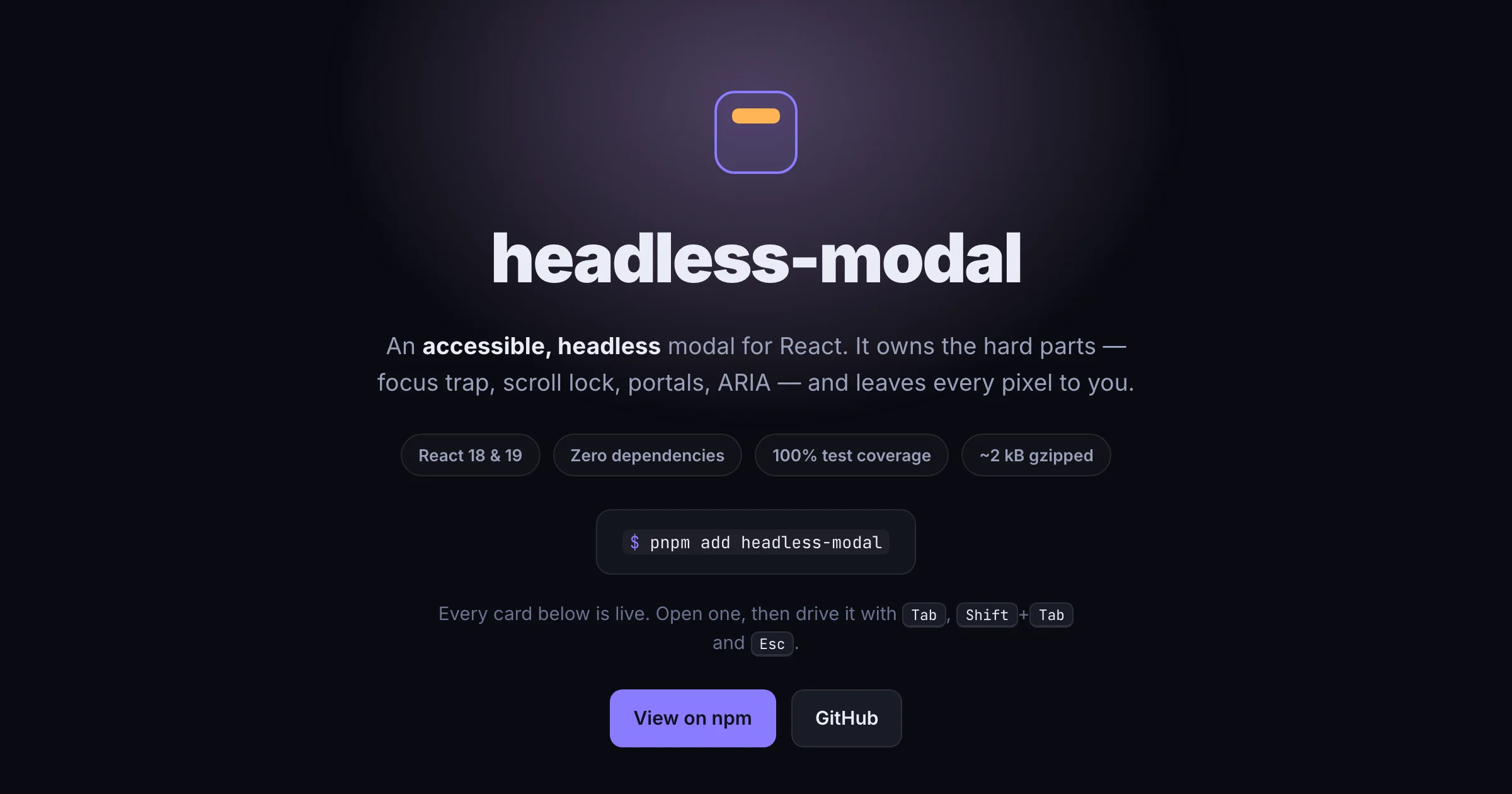
Most hand-rolled radio groups I've seen get maybe half of that. So I built headless-radio-group-react to get all of it, while shipping zero styling.
What it does
It's headless: the library owns the behavior, you own every pixel. There's a small compound component pair for the common case —
<RadioGroup aria-label="Plan" value={plan} onChange={setPlan}>
  <Radio value="hobby">Hobby</Radio>
  <Radio value="pro">Pro</Radio>
  <Radio value="team" disabled>Team</Radio>
</RadioGroup>
— and no CSS comes with it. Each radio renders with data-state="checked" (or "unchecked") and, when relevant, data-disabled. You style those:
[role='radio'][data-state='checked'] { border-color: rebeccapurple; }If components are too much structure, there's a useRadioGroup hook that hands back prop getters you spread onto your own elements — buttons, divs, list items, whatever you're rendering.
How I built it: two decisions that mattered
Roving tabindex without a registry. The fiddly part of roving tabindex is deciding which radio gets tabIndex={0}. It should be the selected one — or, if nothing is selected, the first enabled one. But "first enabled" depends on knowing the full set of radios and their disabled state, in DOM order, which the group doesn't inherently know.
I solved it by having each radio register itself (its value and disabled flag) during render, then resolving the single tab stop in a useLayoutEffect once the list is complete. The effect self-heals: if the radio that owned the tab stop gets disabled or removed, the stop jumps to the selected value, or failing that the first enabled radio — all before the browser paints, so there's never a flash of a wrong tab stop.
The StrictMode bug that doesn't show up in tests. Here's the one that cost me an afternoon. My first version accumulated the registered radios into an array — clear it at the top of each render, push each radio as it registers. Clean, simple, and it passed every test in jsdom.
Then I rendered the demo under <React.StrictMode> (which every real React app uses) and arrow navigation started skipping. In development, StrictMode deliberately double-invokes your render functions to flush out impure code. My array accumulator was impure: the group cleared the array once, but each child rendered twice, so the list came out as [a, a, b, c, c]. Navigation indexes off that list, so "next from a" landed on the duplicate a and went nowhere.
jsdom never caught it because the test environment doesn't simulate StrictMode's double-render. The fix was to key the registry by value — a Map instead of an array — so repeated registrations collapse instead of pile up, while still preserving insertion (DOM) order. It's a small change, but it's the difference between "works in tests" and "works in a real app." I added a StrictMode test so it can never regress.
Try it
pnpm add headless-radio-group-reactIt works with React 18 and 19, has no runtime dependencies, and is covered by tests at 100%. There's a live demo with pricing cards, a segmented control, color swatches, disabled options, and the bare hook — all on one page so you can scroll once and see the whole surface.
This is the latest in a growing collection of headless-* primitives I'm building in public — small, accessibility-first React building blocks that each do one thing well. You can find the rest at github.com/kea0811?tab=repositories&q=headless.
What's next
A few things on the list: optional typeahead (type a letter to jump to a matching option), RTL support so horizontal arrow keys flip in right-to-left layouts, and a tiny helper for rendering hidden native inputs when you need real form submission. If you try it and something feels off, I'd genuinely like to hear about it.
End of essay